User Experience Design: A Practical Guide for Tech Careers
User Experience Design: A Practical Guide for Tech Careers
You're probably closer to user experience design than you think.
Maybe you build APIs and feel annoyed when a signup flow asks for the same information twice. Perhaps you manage infrastructure and wonder why a simple password reset still triggers support tickets. Or you might be studying for a tech certification and notice that some learning platforms guide you cleanly while others make basic tasks harder than they should be. That frustration is often your first UX lesson.
Good products don't just work. They help people understand what to do, do it with less effort, and feel confident they succeeded. That's the core of user experience design. It isn't decoration. It's applied problem-solving for human behavior, business goals, and technical constraints.
If you come from a technical background, that's an advantage. UX work rewards the same habits strong engineers and analysts already use: observing systems, tracing failure points, testing assumptions, and improving outcomes with evidence. The difference is that the system includes people.
What User Experience Design Really Is
A team ships a feature on time. QA signs off. Monitoring shows no outage. A week later, support volume rises, conversion drops, and users abandon the flow halfway through.
Nothing is broken in the technical sense. The experience is.
User experience design is the practice of shaping how people understand, use, and judge a product from their first interaction to their final outcome. It covers the obvious parts, such as screens and interactions. It also covers the hidden parts that decide whether someone succeeds: structure, wording, task flow, feedback, accessibility, and the handoffs between teams and systems.
For technical professionals, UX is easier to grasp if you treat it like performance tuning for human effort. Two products can offer the same feature set, just as two APIs can expose the same endpoints. The difference is how much work the user must do to reach a successful result, and how much uncertainty they carry along the way.
UX Shows Up in the Gap Between Feature Delivery and User Success
Consider a banking app with the right capabilities on paper. Users can transfer money, freeze a card, and download statements. The backlog looks complete.
Then real usage begins. A customer cannot find the transfer option because the label is vague. The session expires while they enter details. The confirmation message is unclear, so they retry and worry they paid twice. Support gets the call, finance gets the complaint, and the product team sees lower trust even though the system stayed online.
UX design addresses that gap. It asks a practical question: can a person complete the task with confidence, without confusion, delay, or avoidable risk?
That question matters because business results follow user behavior. If people hesitate, abandon, repeat steps, or contact support, the product costs more to operate and produces less value.
UX Is Broader Than UI
UI design deals with the interface surface: layout, typography, color, controls, and interaction patterns. UX includes UI, but it also includes the logic around the interface. Research helps teams learn what users are trying to do. Information architecture organizes content so people can find things. Content design clarifies choices and feedback. Prototypes and testing reveal where assumptions fail before code hardens them into production issues.
A useful comparison is this:
- UI is the control panel
- UX is the full trip from intent to outcome
- Service design is the operational system behind that trip
If you want a companion resource focused on the visual layer, AppLighter on app UI principles helps clarify where interface craft ends and broader experience decisions begin.
Accessibility belongs in this definition too, not as a side requirement but as part of whether the product works for real people in real conditions. Keyboard access, readable contrast, clear structure, and understandable content all shape the experience. That commitment is reflected in our accessibility statement.
Why This Matters for Career Growth and Business Value
UX has grown from a design specialty into a cross-functional skill. Companies now expect product managers, developers, QA analysts, content strategists, and technical trainers to notice friction and help reduce it.
This shift creates career upside. A developer who can trace not only system errors but also user confusion becomes more valuable in product discussions. A QA analyst who tests for comprehension, not only correctness, catches issues that metrics alone can miss. A product manager who understands task flow can prioritize work that improves adoption, retention, and support load.
This is one reason UX is worth learning even if "designer" is not your job title.
A Better Mental Model for UX
UX design works like reducing drag in a system. Every unclear label, extra field, inconsistent pattern, missing status message, or inaccessible control adds friction. The task still might be possible, but it takes more effort, creates more doubt, and increases the chance of failure.
Good UX removes that drag. People finish tasks faster. They make fewer mistakes. They trust the product more. The business sees the result in higher completion rates, lower support costs, stronger retention, and fewer expensive fixes after launch.
That is what user experience design really is: a learnable way to improve how products perform for people, and therefore how they perform for the business.
The Core Principles of Great User Experience
If you're trying to evaluate a product, don't start by asking whether it looks modern. Start by asking whether the experience stands up like a solid structure.
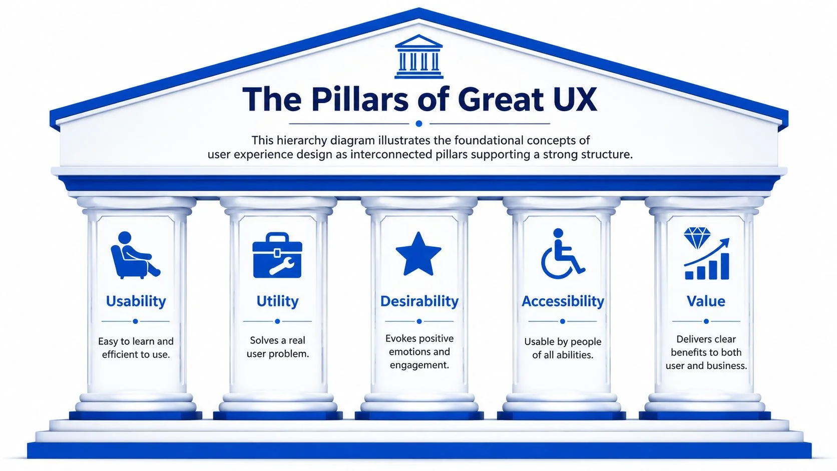
I often teach this as a building problem. A product experience is like a temple. If one pillar is weak, the whole thing becomes unstable. A beautiful interface can still fail if it's confusing. A powerful feature can still fail if people can't access it. A fast workflow can still fail if it solves the wrong problem.
Usability and Utility
The first pillar is usability. People should be able to learn the product quickly, move through it with minimal friction, and recover from mistakes without panic. If a first-time user needs a workaround or a teammate to explain a basic flow, usability is weak.
The second pillar is utility. This sounds obvious, but teams miss it all the time. A product can be easy to use and still not matter if it doesn't solve a real user problem. An elegant dashboard that answers the wrong questions has poor utility.
For technical readers, here's the simplest distinction:
- Usability asks, “Can people use it?”
- Utility asks, “Is it worth using?”
A scheduling tool with a clean calendar view has usable interface mechanics. It only has utility if it helps people coordinate time better than their current method.
Desirability and Value
The next two pillars are where many engineering-led teams hesitate, because they sound softer. They aren't.
Desirability is the product's ability to create confidence, trust, and positive emotion. That can come from clear language, good visual hierarchy, sensible defaults, fast feedback, or a calm tone during high-stress moments like payments or security settings.
Value is the shared payoff. The user gets something important done. The business gets adoption, retention, trust, or revenue. If one side wins and the other loses, the experience usually degrades over time.
Practical rule: If a feature helps the business but creates confusion for the user, that tension will show up later in support costs, abandonment, or poor adoption.
Accessibility Is Structural, Not Optional
The fifth pillar is accessibility, and it isn't a compliance box you check at the end. It's part of quality.
Accessibility-focused UX emphasizes that products must be perceivable, operable, and understandable, and treats inclusive design as a core discipline requiring dedicated research and validation, not just a checklist (UX Magazine on designing for underserved communities).
That means teams need to ask practical questions early:
- Perceivable: Can people detect the information regardless of vision, hearing, or device constraints?
- Operable: Can they operate and interact using different input methods?
- Understandable: Can they make sense of labels, instructions, and outcomes without guessing?
If you want to see how one organization frames its commitment to inclusive access, review our accessibility statement.
How the Pillars Work Together
These principles aren't independent checkboxes. They influence each other.
A useful product becomes less valuable if it isn't accessible. A desirable interface loses its appeal if usability is poor. A usable workflow creates limited business value if it doesn't support an outcome customers care about.
Here's a quick diagnostic table you can use in reviews:
| Principle | Failure pattern | Better question |
|---|---|---|
| Usability | Users hesitate or make avoidable errors | Can a new user finish the task smoothly? |
| Utility | Feature exists but doesn't solve a real need | What problem is this actually fixing? |
| Desirability | Product feels cold, risky, or frustrating | Does the interaction build confidence? |
| Accessibility | Some users are excluded by design choices | Can people with different abilities use this well? |
| Value | Product effort doesn't translate into outcomes | What does success look like for both sides? |
A strong UX practice trains teams to inspect all five pillars, not just the visible one.
The User Experience Design Process Explained
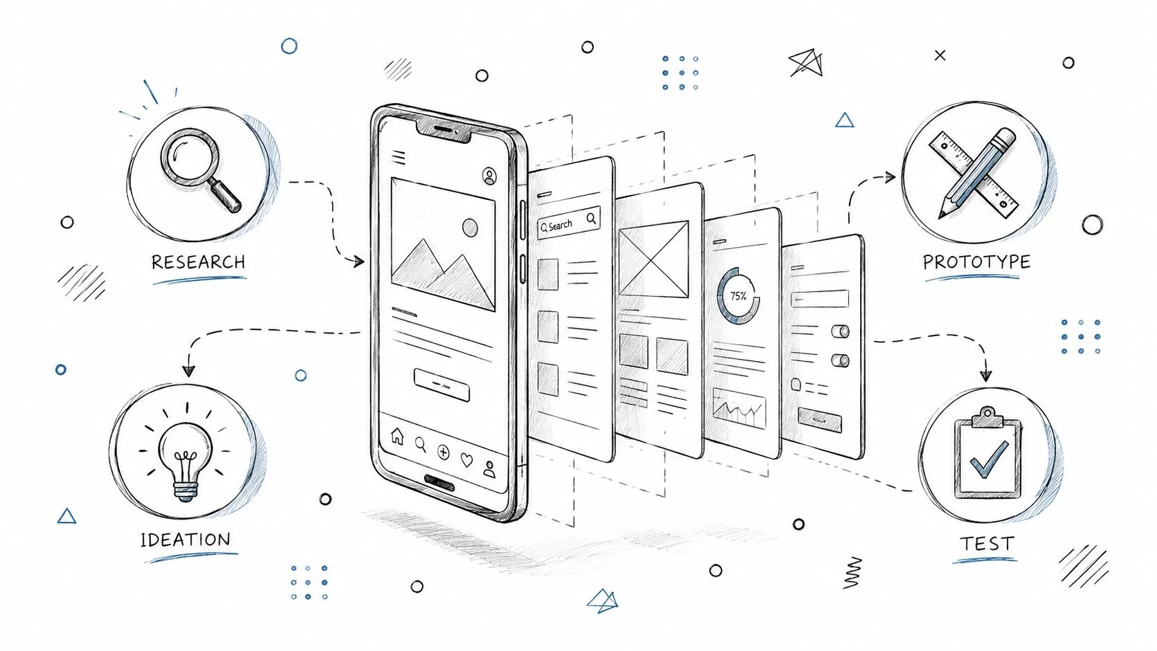
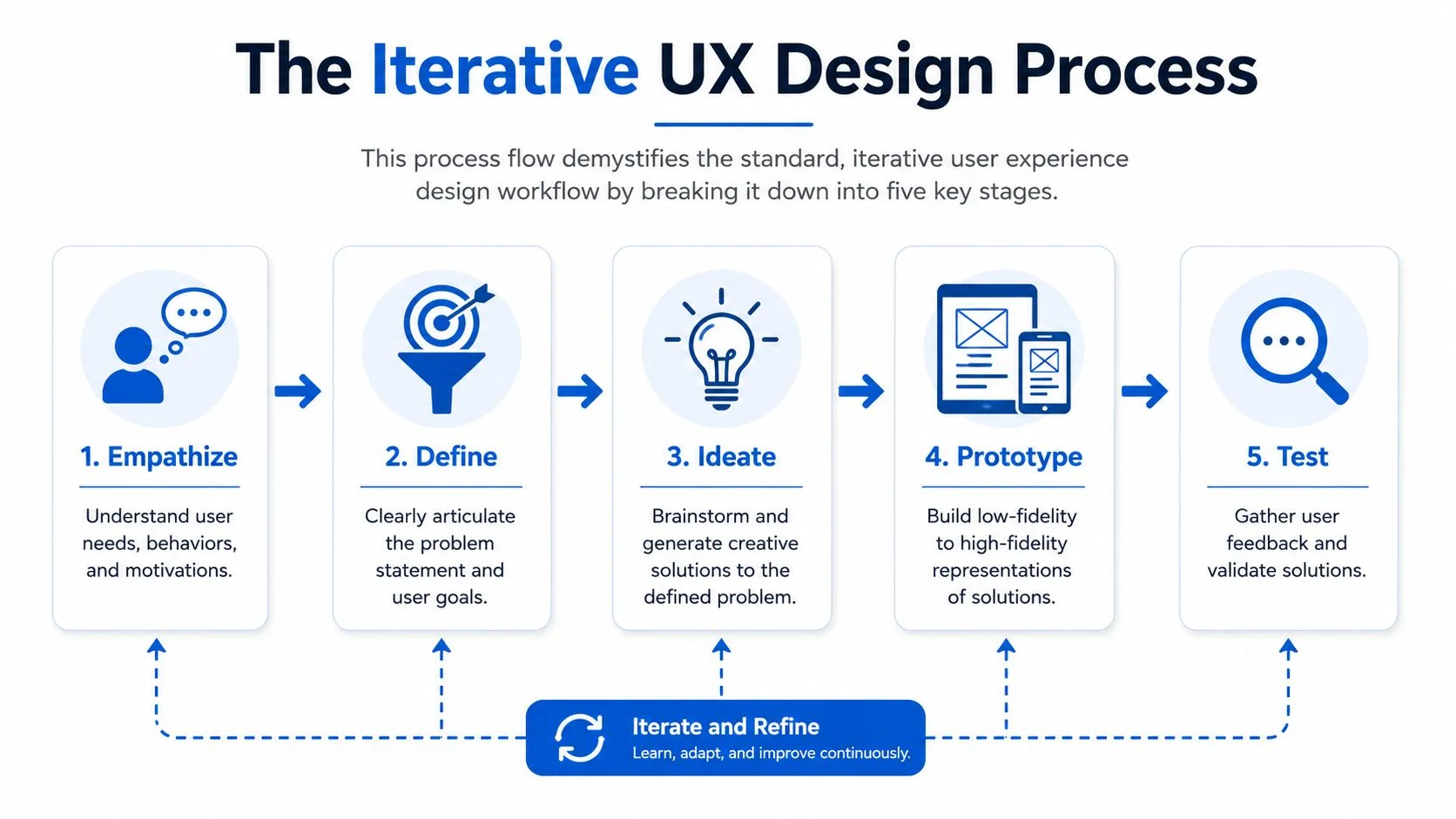
People new to user experience design often expect a clean linear workflow. In reality, UX behaves more like investigation. You gather evidence, form a theory, build a version of the truth, then test whether your theory survives contact with real users.
That's why I like the detective analogy.
A detective doesn't walk into a case, invent the answer, and hope it fits. They collect clues, separate facts from assumptions, reconstruct what likely happened, and test the story against evidence. UX teams should work the same way.
Empathize and Define
The first stage is empathize. Here, you gather clues. You interview users, observe behavior, review support tickets, inspect analytics, and listen for patterns in what people struggle with, fear, avoid, or workaround.
For technical teams, this step can feel too soft until you realize it serves the same function as discovery in engineering. You're trying to understand the system before changing it. The difference is that the system includes human goals, attention limits, and context.
Then comes define. During this stage, many teams rush. They see symptoms and jump straight to screens.
Don't.
Defining means turning messy observations into a clear problem statement. Not “make onboarding better.” Something closer to, “New users don't understand the setup sequence, so they abandon before the first successful task.” A strong definition narrows the work and prevents design drift.
Ideate as Hypothesis Generation
The third stage is ideate. People sometimes picture wild brainstorming sessions with sticky notes everywhere. That can happen, but the point is simpler. Generate multiple ways to solve the defined problem before committing to one.
The first idea is often only the most obvious one, not the best one.
A technical analogy helps here. If performance drops, you wouldn't patch the first component that looks suspicious without checking dependencies and bottlenecks. In UX, ideation keeps you from shipping a local fix that creates a broader failure.
Useful prompts during ideation include:
- Remove friction: What can we simplify, merge, or eliminate?
- Clarify the path: What should be more visible or better labeled?
- Reduce risk: Where do users need reassurance, feedback, or confirmation?
- Support edge cases: What happens when someone is interrupted, uncertain, or using assistive technology?
The quality of UX ideas depends less on originality and more on how well they respond to a clearly defined user problem.
Prototype and Test
The fourth stage is prototype. This is your reconstruction of the case. You build a version of the solution that people can react to.
A prototype might be paper sketches, wireframes in Figma, a clickable flow, or a high-fidelity mockup. The right fidelity depends on what you need to learn. If the question is about structure, low fidelity is often enough. If the question is about trust, tone, or visual hierarchy, you may need something closer to the final experience.
The fifth stage is test. In this phase, your theory meets reality.
You put the prototype in front of users and watch what happens. Not what they say they'd do in the abstract. What they do when given a task. Do they find the entry point? Do they misread labels? Do they hesitate at decision moments? Do they complete the task with confidence?
Why the Process Loops
The most important thing to understand is that this isn't a one-way sequence. It loops.
A test may reveal that the prototype is fine but the original problem statement was too broad. New research may show that your assumptions about the user were incomplete. A workable solution for one segment may fail for another.
That loop is healthy. It's how teams avoid expensive certainty.
Here's the process in plain language:
| Stage | Detective analogy | UX question |
|---|---|---|
| Empathize | Gather clues | What's really happening for users? |
| Define | Frame the case | What exact problem are we solving? |
| Ideate | Form hypotheses | What are several plausible solutions? |
| Prototype | Reconstruct events | What can we make tangible to learn quickly? |
| Test | Check theory against evidence | Does this solve the problem in practice? |
If you remember one thing, remember this: User experience design isn't about guessing what users want. It's about building a disciplined learning loop around real behavior.
Essential UX Methods and Key Deliverables
A new UX designer with an engineering background often asks the same practical question: what are we making besides screens?
The short answer is this. UX work produces two kinds of outputs. Methods help the team learn something. Deliverables help the team remember it, discuss it, and build from it.
That distinction matters because UX is a business skill, not just a design craft. Good methods reduce uncertainty before a team spends weeks building the wrong thing. Good deliverables turn research and design decisions into shared tools that product, engineering, support, and leadership can all use.
Research Artifacts That Turn Messy Input Into Clear Direction
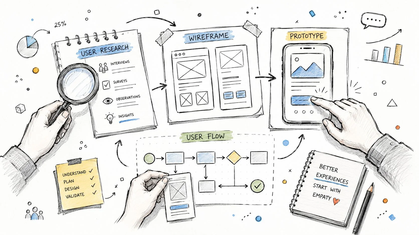
Early UX work often feels messy on purpose. You collect interview notes, support tickets, survey responses, product analytics, and observations from real usage. At first, it can look like a pile of unrelated clues.
Research artifacts are what turn that pile into something a team can act on.
Common examples include:
- Personas: Brief profiles of key user groups, including goals, constraints, behaviors, and context.
- Empathy maps: A structured view of what users say, think, do, and feel during a task.
- Journey maps: A step-by-step view of the user path, including friction, uncertainty, and handoffs.
- Problem statements: Clear definitions of who is struggling, what is going wrong, and what outcome needs to improve.
A technical analogy helps here. Raw research is similar to logs from a production system. Useful, but hard to act on by itself. A journey map or problem statement works like a cleaned-up incident report. It highlights where the failure happened, what conditions surround it, and what the team should investigate first.
These artifacts also help teams stop debating from personal preference. Instead of "I think users want this," the conversation becomes "Our research shows this step causes drop-off for first-time users." That shift improves decisions and makes UX work easier to defend inside organizations that care about evidence.
Journey maps are especially useful when the experience stretches across several touchpoints. A customer might start with an ad, continue through a signup flow, hit a verification email, open a mobile app, and contact support when something breaks. If your deliverables only describe one screen, they miss the complete experience.
Design Outputs That Help Teams Build the Right Thing
Once the problem is clearer, the deliverables move closer to implementation.
Common Solution Deliverables
- User flows: Diagrams showing how someone moves from entry point to task completion.
- Sitemaps and information architecture diagrams: Structures that show how content, features, and categories are organized.
- Wireframes: Low-detail layouts focused on hierarchy, structure, and interaction.
- Mockups: Higher-detail representations of interface patterns, layout, and content.
- Interactive prototypes: Clickable models used for reviews, usability testing, and stakeholder alignment.
Wireframes work like pseudocode for product experience. They let teams test structure and logic before investing in polished visuals or engineering time.
A user flow answers, "What path should this person take?" A wireframe answers, "What appears on each step?" A prototype answers, "Does this hold together when someone tries to use it?" Each deliverable reduces a different kind of risk.
Here's a practical mapping of methods and outputs:
| Process stage | Common methods | Typical deliverables |
|---|---|---|
| Empathize | Interviews, observation, survey review | Personas, empathy maps, research notes |
| Define | Affinity grouping, synthesis workshops | Problem statements, journey maps |
| Ideate | Sketching, brainstorming, design studio sessions | Concept sketches, flow options |
| Prototype | Wireframing, interactive modeling | Wireframes, mockups, clickable prototypes |
| Test | Usability sessions, task walkthroughs | Findings reports, issue lists, revision priorities |
A quick visual walkthrough can help make these artifacts more concrete:
What Strong Teams Do Differently With Deliverables
The deliverable itself is not the value. The decision it supports is the value.
In weak teams, personas go stale, wireframes get polished too early, and research findings stay trapped in one designer's notes. In stronger teams, every artifact has a clear job. A journey map reveals where customers fall between channels. A flow diagram exposes unnecessary branches. A usability report separates minor irritation from issues that block completion, revenue, or retention.
Mentor's note: Don't judge a UX deliverable by how polished it looks. Judge it by whether it helps the team make a better decision.
That mindset is one reason UX becomes a career advantage for technical professionals. If you can produce artifacts that clarify tradeoffs, reduce wasted engineering effort, and tie design choices to user outcomes, you become more valuable well beyond the design team.
Measuring the Business Impact of UX Design
If you want UX to be taken seriously inside a company, you can't stop at “users like it better.” You need to connect design choices to outcomes leaders already care about.
That doesn't mean reducing UX to a spreadsheet. It means proving that less friction changes behavior in ways the business can observe.
The strongest headline number in this space is hard to ignore. The benchmark return on investment for UX is 9,900%, meaning every $1 invested can yield $9,900 in return, and the same source notes that top-tier UX development practices can lead to an 83% surge in conversion (UXCam UX statistics).
Why ROI Shows Up So Strongly
Those returns make sense when you look at what UX changes.
A better flow reduces abandonment. Clearer navigation shortens task completion. Better hierarchy lowers errors. Better content reduces hesitation. Better feedback prevents repeat actions and support contacts. Performance improvements remove friction at exactly the moment a customer is deciding whether to continue.
This is why UX should be discussed with product, engineering, support, and leadership together. It affects all of them.
Metrics That Make UX Visible
You don't need a giant analytics stack to start measuring UX well. You need a few metrics tied to user goals and business outcomes.
Metrics Teams Commonly Track
- Conversion rate: How many users complete the intended action, such as signup, purchase, or activation.
- Task success rate: Whether users can finish a defined task without assistance.
- Time on task: How long it takes to complete a workflow.
- User error rate: Where people make mistakes, backtrack, or trigger preventable failures.
- Usability score: A structured way to capture perceived ease of use after testing.
The key is choosing metrics that fit the job. For a checkout flow, conversion and abandonment matter. For an internal admin tool, time on task and error rate may matter more. For onboarding, first successful completion may be the primary signal.
A Practical Way to Tie UX to Business Goals
Use this pattern when making the case:
| UX change | User effect | Business effect |
|---|---|---|
| Clearer navigation | People find the next step faster | More completions, fewer drop-offs |
| Better form design | Fewer input mistakes | Higher submission success, less support load |
| Stronger feedback messages | More confidence after actions | Fewer duplicate actions and complaints |
| Simpler information architecture | Less searching and confusion | Better adoption of key features |
This framing works because it translates design into operational language.
If you can show that a design change reduced friction on a critical path, you're no longer defending aesthetics. You're improving system performance from the user's point of view.
A technical audience usually responds well to that idea. UX isn't soft. It's a disciplined way to improve outcomes by making the human side of the system easier to use correctly.
Common UX Career Paths and Core Roles
One reason people get confused about UX careers is that the field uses overlapping titles. Different companies draw the boundaries differently. One “product designer” may do research, interaction design, and UI work. Another may focus mostly on interface execution. A “UX designer” at one company might look like a service designer or content strategist somewhere else.
Still, there are common patterns.
Business demand keeps these roles relevant because a well-designed, frictionless UX can raise conversion rates by up to 400%, and 89% of consumers will shop with a competitor after a poor user experience (Adobe on UX statistics). When user behavior changes that sharply, companies need people who can diagnose and improve the experience.
Comparison of Common UX Roles
| Role | Primary Focus | Key Skills | Example Deliverables |
|---|---|---|---|
| UX Designer | End-to-end user flows and experience quality | Research synthesis, wireframing, interaction design, testing | User flows, wireframes, prototypes, usability findings |
| UI Designer | Visual interface design and interaction polish | Layout, typography, color, component systems, visual hierarchy | High-fidelity mockups, UI kits, screen states |
| UX Researcher | Understanding user behavior and needs | Interviewing, study design, synthesis, insight communication | Research plans, interview guides, findings reports, journey maps |
| UX Writer | Product language and interface communication | Plain language, content design, error messaging, microcopy | Button labels, onboarding text, error messages, content guidelines |
How to Choose a Direction
If you like broad problem-solving, UX Designer is often the best entry point. You'll touch research, structure, and testing, and you'll learn how product decisions connect.
If you care about interaction detail, layout systems, and visual consistency, UI Designer may fit better. This role often works closely with design systems and front-end teams.
If you enjoy interviews, pattern finding, and making ambiguous behavior understandable, UX Researcher is a strong path. It suits people who like evidence and can communicate nuance clearly.
If you're sharp with language and care about clarity, trust, and tone, UX Writer is more technical than many people realize. A single confusing error message can derail an entire task.
A Note for Career Changers From Technical Roles
People with engineering, QA, support, business analysis, and project backgrounds often transition well into UX because they already understand systems, constraints, and failure modes.
For example:
- QA professionals already notice edge cases and broken flows.
- Developers understand implementation tradeoffs and can collaborate tightly with product teams.
- Support specialists hear recurring friction directly from users.
- Project managers often excel at coordinating cross-functional UX work, and structured planning habits from resources like comprehensive PMP study materials can transfer well into roadmap thinking, stakeholder communication, and delivery discipline.
Career titles matter less than the underlying capability. Teams value people who can identify friction, explain it clearly, and help remove it.
That's why user experience design is such a useful skill set even if your title never includes “designer.”
Your Next Steps in User Experience Design
The best way to learn user experience design is to practice it on ordinary things. Don't wait for permission, a design title, or the perfect portfolio brief.
Start with the products around you. Pick one task you use every week. A login flow. A settings page. A checkout process. A certification dashboard. Walk through it slowly and ask: where does the user hesitate, guess, backtrack, or lose confidence? That habit alone will sharpen your judgment.
Build Skill Through Small, Concrete Exercises
You don't need a client to start.
Try a few of these:
- Redesign one narrow workflow: Improve password reset, search, or onboarding for a real product you use.
- Document the current journey: Show each step, the friction points, and your reasoning for changes.
- Create a simple prototype: Use Figma, pen and paper, or even slides to make the new flow tangible.
- Test with a few people: Ask them to complete a task and observe where they struggle.
That sequence teaches the true discipline. Not just “make nicer screens,” but identify a problem, propose a better path, and validate it.
Build a Portfolio Around Thinking, Not Polish
Early portfolios often fail for one reason. They show final screens without showing the decision process.
Hiring teams usually want to understand how you think. What problem did you identify? What evidence did you gather? What tradeoffs did you make? What changed after testing?
If you want examples of how product work gets presented in startup contexts, this collection of best design portfolios for startups is useful because it shows different ways designers frame projects, decisions, and outcomes.
A strong beginner case study often includes:
- The problem: What user or business issue existed?
- The context: Who was affected and under what constraints?
- The approach: What research or review did you do?
- The solution: What did you change and why?
- The reflection: What would you test next or improve further?
Learn in a Way That Sticks
If you already work in tech, study UX the same way you'd study a technical domain. Focus on concepts, patterns, and repeated practice. Memorizing vocabulary won't help much if you can't diagnose a confusing flow in the wild.
That means mixing theory with application:
- Read foundational material on usability, accessibility, interaction design, and research methods.
- Analyze real products instead of only consuming inspiration galleries.
- Practice critique by explaining why a flow works or fails.
- Collaborate with others so your ideas meet constraints and feedback.
If you prefer structured learning paths across tech disciplines, online certification courses can also reinforce the broader professional habit that matters in UX too. Learn the concept, apply it, check your understanding, repeat.
Think Like a UX Professional in Your Current Role
You don't have to switch jobs immediately to use this skill.
If you're a developer, ask whether the interface state matches the user's mental model. If you're in support, tag repeated complaints by task and pattern. If you're in QA, note where the workflow is technically correct but humanly confusing. If you manage projects, create space for research and testing before delivery locks in.
That's how many people enter UX. Not by declaring a career change on day one, but by becoming the person on the team who notices friction and can describe a better alternative clearly.
User experience design is learnable. It rewards curiosity, observation, humility, and disciplined iteration. Those are not exclusive to designers. They're professional skills.
MindMesh Academy helps tech professionals build real understanding, not just exam familiarity. If you're growing into more user-centered work, strengthening your technical foundation, or planning your next career move, explore our certifications for structured learning that supports practical, career-ready skill development.

Written by
Alvin Varughese
Founder, MindMesh Academy
Alvin Varughese is the founder of MindMesh Academy and an enterprise architecture leader. An electrical engineer by training, he moved from factory automation in South Africa to cloud architecture at GE Appliances and Humana (Fortune 50), and holds 20 professional certifications including AWS Solutions Architect Professional, Azure DevOps Engineer Expert, and Microsoft Agentic AI Business Solutions Architect. He built MindMesh Academy after interviewing too many highly certified candidates who couldn't answer basic questions: the goal is prep that makes you better at the job, not just able to pass the exam.