Your Guide to the Power BI Measure
Your Guide to Mastering Power BI Measures for IT Professionals
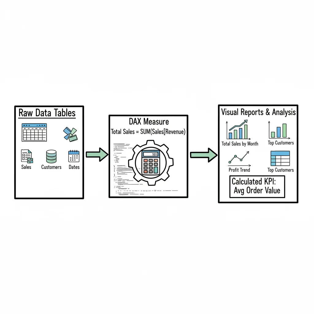
A Power BI measure provides dynamic intelligence for your reports. This calculation engine ensures your charts, tables, and KPIs update instantly as you explore, filter, or question the data. For IT professionals building analytical solutions, mastering these measures is fundamental to creating interactive and insightful dashboards. This technical skill appears frequently in data analysis certifications. It remains critical for delivering direct business value. By learning to implement these calculations effectively, you can move beyond static data to build flexible reports that adapt to any specific user requirement.
The Engine of Dynamic Reports: Understanding Power BI Measures
Fundamentally, a Power BI measure is a calculation logic you create using DAX (Data Analysis Expressions). The key difference, especially for those moving from traditional static database queries or standard spreadsheets, is that a measure does not store pre-calculated values in your data tables. Instead, it executes its calculation on demand. It reads the current context of your report—such as which filters are active or which date ranges are selected—to provide precise, aggregated results in real-time.
Think of your data tables as vast reservoirs of raw information. A measure behaves like a specialized analyst who, upon your request, instantly performs a specific calculation. For instance, if you ask for "Total Sales for Products in Europe for Q1," the measure does not simply pull a static number from a cell. It scans the relevant data rows, applies the filters you have set on your report page, and performs the sum then and there.
This dynamic capability changes static data into an interactive tool for exploration. It allows users, including business analysts and executives, to independently filter and group data. This reduces the time spent waiting for technical teams to build new queries for every variation of a report. The efficiency gained is measurable. Various analyses show that features like Power BI measures help users save over two hours per week (verify current productivity statistics on the vendor site). For more details on these trends, you can view findings on Power BI adoption on AcuityTraining.co.uk.
Measures vs. Calculated Columns: A Critical Distinction for Performance
A common hurdle for those starting with Power BI is deciding between a measure and a calculated column. Both use DAX formulas, but they function in very different ways within the Power BI engine. This distinction is a major focus for anyone preparing for data-related certifications, as choosing the wrong one can lead to slow reports or bloated file sizes.
A calculated column adds data directly to your table. Its values are computed for every single row when the data is first loaded or refreshed. These results are then stored in the system's memory (RAM). Because every row has a stored value, a calculated column increases the file size of your report. If you have a table with millions of rows, adding a calculated column uses a significant amount of memory.
A measure, on the other hand, calculates a single value only when it is needed for a visual. It typically uses CPU power at the moment of the query rather than occupying permanent memory for every row. Because the measure is just a formula and not a list of millions of results, it keeps your data model lean and fast.
This architectural choice affects how your report scales. Understanding these mechanics is helpful for certifications such as the Microsoft Power Platform Fundamentals. Exploring resources like What is Power Platform can clarify why specific tools are built to handle data in these ways.
To help you decide which to use, consider this comparison of their core attributes:
Power BI Measures vs. Calculated Columns
| Attribute | Power BI Measure | Calculated Column |
|---|---|---|
| Calculation Time | On-the-fly (at query time, dynamic) | During data refresh (pre-calculated, static) |
| Storage Impact | Stored once in the data model (minimal) | Stored in memory (RAM) for each row |
| Context | Evaluated based on filters in the report | Evaluated row-by-row during refresh |
| Primary Use | Aggregations (e.g., Total Sales, Average Price, Ratios) | Row-level logic (e.g., categorizing data, simple transformations) |
| When to Use | For ratios, percentages, and dynamic totals that respond to user interaction, or complex aggregations. | When you need a new, static attribute for filtering, slicing, or for use on a chart axis, and the calculation is simple and row-specific. |
Key Takeaway: If your calculation must respond to user selections or perform a mathematical aggregation, a measure is the correct choice for performance. For static, row-level attributes that do not change with user interaction, a calculated column might be used, though it should be used sparingly to save memory.
The Foundation of Dynamics: DAX and Evaluation Context
To build these measures, you will use DAX (Data Analysis Expressions). While the name may seem technical, DAX is a formula language that shares some logic with Excel formulas but is optimized for large-scale data models.
The core principle of DAX is evaluation context. This concept allows a measure to be adaptable. A measure does not result in a single fixed number; it produces a number based on the specific context of the visual where it is placed.
For example, if you place a "Total Sales" measure in a table next to a list of Product Category names, the DAX engine understands that it must calculate the sales for each specific category. If you then click a bar for "Electronics" in a different chart on the same page, the context for the entire report changes. The measure instantly recalculates the table to show only the electronics sales. This automatic recalculation is why measures are vital for modern business intelligence.
Understanding context also helps you avoid the "average of averages" mistake. If you use a calculated column to find a profit margin for every row and then average that column, you get a different (and often incorrect) result than if you use a measure to sum total profit and divide it by total sales. The measure handles the math at the correct level of aggregation every time.
Reflection Prompt: How might understanding evaluation context relate to how you approach complex conditional logic in other IT domains, such as network ACLs or cloud security policies?
The Building Blocks: Your First DAX Functions
The DAX library contains more than 250 functions, but you do not need to learn them all at once. Most reporting tasks are handled by a small group of foundational functions. Mastering these is the first step toward becoming proficient in data analysis.
- SUM: This is the most common function for adding up numerical values. It is used for total revenue, total units sold, or any other simple total. It ignores blank rows and only adds up the numbers in the column you specify.
- AVERAGE: This function finds the arithmetic mean of a column. It is useful for calculating average order values, average delivery times, or average test scores. Like SUM, it only looks at the numbers and ignores empty cells.
- COUNT: This function counts the number of cells in a column that contain information. It is useful for finding the total number of transactions, the number of support tickets, or the count of items in an inventory list.
- DISTINCTCOUNT: This is a more specific version of the count function. It ignores duplicates and only counts the unique values in a column. If one customer makes five separate purchases, a COUNT of the
CustomerIDcolumn would return five, but a DISTINCTCOUNT would return one. This is essential for finding the actual number of individual customers or unique products sold.
These four functions are the primary tools for building business intelligence reports. They provide the basic logic needed to interpret data and present it to decision-makers.
As the following diagram illustrates, measures act as the connective tissue in your reporting environment. They take the rules you write in DAX, apply them to the data model, and send the resulting insights to your visuals.
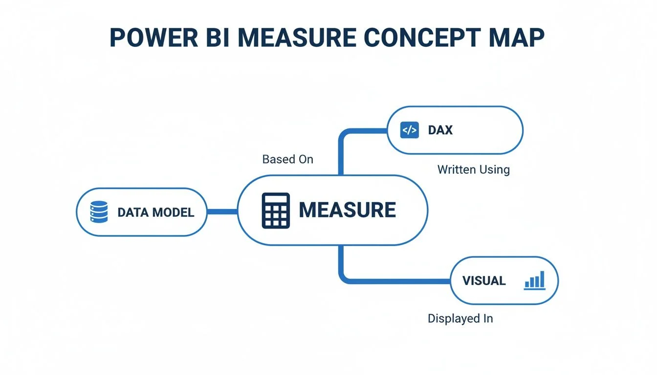
The measure serves as the bridge that turns static tables into the interactive charts and graphs seen on a report canvas.
Putting Your First Functions to Work
To see how these functions operate in a real scenario, imagine a Sales table with columns for SalesAmount, CustomerID, and Product. You can create three distinct measures using very little code:
To calculate the total money coming into the business, use this DAX formula:
Total Revenue = SUM(Sales[SalesAmount])
To see how many sales transactions have occurred, use this formula:
Number of Transactions = COUNT(Sales[SalesAmount])
To identify how many separate customers have bought something, use this formula:
Unique Customers = DISTINCTCOUNT(Sales[CustomerID])
By using these functions, you are doing more than just looking at a list of numbers. You are creating a system where the data answers your questions. The answers change instantly as you filter the report by date, region, or product type.
The real strength of this system is "measure branching." This is the practice of using one measure inside another. For example, once you have created the Total Revenue and Number of Transactions measures, you can create a fourth measure for "Average Transaction Value" by simply dividing the first by the second. This method makes your formulas easier to read and maintain. If you ever need to change how "Total Revenue" is calculated, you only have to update it in one place, and all other measures that use it will update automatically. This layered approach is a standard practice for professional data analysts.
Mastering Core DAX Functions in Your Measures
Once you understand foundational functions like SUM and AVERAGE, you have a solid base for data reporting. However, simple column totals rarely provide the full story required for high-level decision-making. To progress, you must transition to functions that transform static reports into dynamic analytical tools. Gaining proficiency in CALCULATE, SUMX, and logic-based functions like IF or DIVIDE separates basic data summarization from technical analysis. These specific skills are central to success in advanced data certifications and professional modeling roles.

These core functions drive nearly every complex measure you will build in Power BI. A firm grasp of their internal logic is essential for any IT professional focused on data modeling. Without these tools, your reports remain limited to the data as it exists on the page, rather than as it could be interpreted through different business lenses.
The Superpower of DAX: CALCULATE
If you choose to master only one DAX function, it should be CALCULATE. This function is the most influential tool in the Power BI library. It acts as a control center for your data, allowing you to take any existing measure and change the context in which it is evaluated. In technical terms, it modifies the filter context of an expression.
The function requires an initial expression, such as your [Total Sales] measure. After the expression, you add one or more filter arguments. When the engine processes the formula, it applies your new filters first, either adding to the current report filters or overriding them entirely.
This mechanism allows you to answer sophisticated business questions with a single line of code. For instance, CALCULATE makes it possible to compare the sales of a specific product category against the total sales of the entire company. You can use it to view sales from the previous fiscal year regardless of which month a user selects on a slicer. This ability to create benchmarks, ratios, and comparative sets provides the perspective leaders need to spot trends. Data analyst certification exams heavily prioritize this function because it demonstrates a deep understanding of the Power BI engine.
Iterators: The Row-by-Row Workers
Iterator functions are the next step in building advanced measures. You can identify them by the "X" suffix: SUMX, AVERAGEX, COUNTX, and others. These functions work differently than standard aggregators. While a standard SUM looks at an entire column and adds the values, an iterator goes through a table one row at a time.
The SUMX function follows a three-step internal process:
- It looks at a specific table or a filtered subset of a table.
- It performs a calculation for every single row in that table.
- It aggregates those individual results into a final total.
Consider a Sales table containing Quantity and PricePerUnit columns. If you simply sum the quantity and multiply it by the sum of the unit price, the math will be incorrect for almost every business scenario. You need the revenue for each specific transaction first. You must multiply quantity by price for row one, then row two, and continue until the end of the table. Only after these line-level calculations are finished can you sum the results for an accurate total revenue figure.
Iterators like SUMX are the primary tools for any calculation requiring row-level math before an aggregation occurs. They create a temporary computation in memory for each row, ensuring the logic remains accurate across complex data models. Using them correctly prevents the mathematical errors that often plague beginner reports.
The following measure shows how to use SUMX to determine total revenue by calculating line-item totals before summing them:
Total Revenue = SUMX(Sales, Sales[Quantity] * Sales[PricePerUnit])
This formula shows how a measure can contain multi-step logic to produce a single, reliable insight. Mastering these row-level workers is a major milestone in your development as a data professional.
Writing Cleaner and Safer Measures
Building resilient DAX is a requirement for any production-ready report. A dashboard loses its value if the data is unreliable or if visuals break during use. Using IF and DIVIDE helps you build measures that handle errors and edge cases gracefully. These functions ensure your users see clean data rather than cryptic error messages.
The IF function allows for conditional logic and basic safety checks. A common use case is preventing the "divide-by-zero" error. If a measure tries to divide a number by zero, the visual may crash or display an error that confuses the end user. You can wrap your calculation in a check to ensure the denominator is valid.
Profit Margin = IF([Total Sales] > 0, [Total Profit] / [Total Sales], BLANK())
While this logic works, Power BI provides the DIVIDE function as a more efficient alternative. It is built specifically for division and includes an internal check for zero denominators. If the denominator is zero or empty, the function returns a blank result or an alternative value you specify. This keeps your code concise and your visuals stable.
The profit margin measure becomes much cleaner with this approach:
Profit Margin = DIVIDE([Total Profit], [Total Sales])
Using DIVIDE instead of the standard / operator is a fundamental best practice. It improves the stability of your reports and shows a professional level of DAX proficiency. Reliable reports lead to higher adoption rates across an organization. Power BI is currently used by roughly 97% of Fortune 500 companies for their analytics needs, a testament to the platform's reliability when configured correctly. You can view more detailed data on Power BI's market share in this statistical overview.
Reflection Prompt: How do the principles of using DIVIDE for error handling compare to error handling strategies you use in programming languages (e.g., try-catch blocks) or scripting?
By using these core functions, you move beyond simple data entry and into the role of a professional analyst. You gain the ability to build reports that provide deep value while remaining accurate under the pressure of real-world business questions.
Practical Examples of Essential Power BI Measures
Theory provides a necessary foundation, but mastering the Power BI measure requires hands-on application within the desktop environment. This section connects abstract logical concepts with specific, real-world examples that you can apply to your own datasets immediately. For IT professionals and data analysts, these practical patterns function as standard code blocks. They are the essential parts of any sophisticated analytical system.
We will examine specific, functional examples that solve common business problems. These formulas are modular. You can start with a basic calculation and then wrap it in more advanced logic to find deeper trends in your data. We will begin with sales analytics, which is the primary use case for most business intelligence dashboards and reporting projects.
Building Essential Sales Metrics
Tracking revenue is a universal requirement across all organizations. This makes sales data an excellent place to practice building DAX logic. We will start by creating a basic aggregation and then extend that logic to find time-based trends. This step-by-step progression is a standard workflow for any data modeling task.
Our first step involves a basic aggregation using the SUM function. This function serves as the workhorse for many other calculations in your model.
1. Total Sales
This is the most basic metric for a sales dashboard. it simply adds up every value found in your revenue column.
- DAX Code:
Total Sales = SUM(Sales[SalesAmount]) - How It Works: The
SUMfunction looks at theSalesAmountcolumn within yourSalestable and calculates the total. This calculation happens within the filter context of your report. If you add a slicer for a specific year or product category, the measure automatically recalculates to show only the sales for that selection. It is much more efficient than a calculated column because it does not store the result in your memory; it computes the value only when the visual needs it. - Business Insight: This measure provides the high-level revenue number for the entire company. Because it is dynamic, you can place it in a card visual to show grand totals or in a bar chart to see how revenue is distributed across different branches, regions, or product lines.
Once you have established Total Sales as a base, you can use the time intelligence functions in Power BI to compare performance across different dates. This is a requirement for financial reporting and general business planning.
2. Year-to-Date (YTD) Sales
A year-to-date calculation is a standard part of any financial report. It helps stakeholders see how the company is performing relative to the start of the current calendar or fiscal year.
- DAX Code:
YTD Sales = TOTALYTD([Total Sales], 'Date'[Date]) - How It Works: The
TOTALYTDfunction uses your existing Total Sales measure and evaluates it within a specific time window. It looks at the latest date in your current report view and then aggregates all sales from January 1st up to that date. To make this work correctly, you must have a proper date table in your model that has been designated as the "Date Table." This function essentially automates the complex filtering logic required to define a year-to-date window. - Business Insight: This calculation is useful for tracking progress toward annual revenue goals. By looking at YTD numbers month over month, managers can see if the pace of sales is increasing or if the company is falling behind its yearly projections.
Creating Powerful Ratio Measures
Measures are not just for basic addition. They become much more useful when you combine multiple calculations to create ratios and Key Performance Indicators (KPIs). The profit margin is a standard example of taking two basic numbers and turning them into a descriptive metric that explains business health.
To calculate your margin, you first need a measure for your total profit.
Total Profit = SUM(Sales[ProfitAmount])
With Total Sales and Total Profit ready, you can create the ratio. Using the DIVIDE function is a best practice for professional DAX development because it handles potential errors more effectively than standard math operators.
3. Profit Margin
This KPI shows what percentage of your total revenue actually stays with the company as profit after all costs are considered.
- DAX Code:
Profit Margin = DIVIDE([Total Profit], [Total Sales]) - How It Works: The
DIVIDEfunction takes Total Profit as the numerator and Total Sales as the denominator. A major advantage of this function is how it handles division by zero. If a specific product had no sales during a filtered period, a standard division sign (/) would return an error or an "infinity" value that could break your visual. TheDIVIDEfunction automatically returns a blank or a zero in those cases, keeping your report stable. - Business Insight: Profit margin provides a clearer view of financial health than revenue alone. High revenue with a low margin might indicate that costs are too high. By breaking this measure down by product category or salesperson, you can identify which areas of the business are the most efficient.
Efficient data models often use a structure called a "measure tree." In this setup, basic measures like Total Sales act as the building blocks for more complex logic like Profit Margin or YTD Sales. This method makes your DAX code easier to maintain because if you need to change the logic for "Sales," you only have to update it in one place rather than in every individual formula.
Unlocking Time Intelligence Comparisons
Comparing current results to past performance is one of the most common tasks in business intelligence. DAX includes a variety of functions to help you perform these comparisons. If you want to learn more about how these metrics appear in a final report, you can view our guide to data visualization with Power BI for more context.
We will now create a measure to find sales from the previous year. This is a vital part of calculating year-over-year (YoY) growth.
4. Prior Year Sales (PY Sales)
This formula uses the CALCULATE function and the SAMEPERIODLASTYEAR function to look back at historical data.
- DAX Code:
PY Sales = CALCULATE([Total Sales], SAMEPERIODLASTYEAR('Date'[Date])) - How It Works:
CALCULATEis the most versatile function in DAX because it can change the filters on a calculation. Here, it takes the current date filter in your report and tells the engine to look at the same dates but exactly one year earlier. If your report is currently filtered to June 2024, this measure will return the total sales from June 2023. - Business Insight: Putting this measure next to your current sales in a bar chart or table gives an instant view of growth. It allows you to see if your current performance is better than your historical baseline, which is key for identifying long-term trends.
Once you have the prior year data, you can calculate the actual growth percentage.
5. YoY Sales Growth %
This measure combines your current and previous data to find the percentage change over the last twelve months.
- DAX Code:
YoY Sales Growth % = DIVIDE([Total Sales] - [PY Sales], [PY Sales]) - How It Works: It finds the difference between the current year and the previous year, then divides that difference by the previous year's total. This results in a percentage that shows the rate of change.
- Business Insight: This is a vital metric for executive leadership. It provides a clear signal of business momentum. A positive percentage shows growth, while a negative percentage highlights areas where the business might be shrinking compared to the previous year.
To help you build more reports, use the following reference table for other common time-based calculations.
Common Time Intelligence DAX Patterns
This table provides a reference for common time patterns and the specific business questions they help answer. It is a useful resource for analysts preparing for technical certifications or building complex reports.
| Calculation | DAX Function Example | Business Question It Answers |
|---|---|---|
| Month-to-Date (MTD) | TOTALMTD([Total Sales], 'Date'[Date]) | "What are the total sales accumulated so far this month?" |
| Quarter-to-Date (QTD) | TOTALQTD([Total Sales], 'Date'[Date]) | "How is our progress tracking against the current quarterly goal?" |
| Previous Month Sales | CALCULATE([Total Sales], PREVIOUSMONTH('Date'[Date])) | "Are our sales this month higher or lower than the month before?" |
| Sales Same Period Last Year | CALCULATE([Total Sales], SAMEPERIODLASTYEAR('Date'[Date])) | "Are we performing better now than we were at this exact time last year?" |
| 3-Month Moving Average | AVERAGEX(DATESINPERIOD('Date'[Date], LASTDATE('Date'[Date]), -3, MONTH), [Total Sales]) | "What is the recent trend in sales when we smooth out short-term fluctuations?" |
These patterns are flexible. Once you understand the core logic, you can replace Total Sales with other values like Total Profit, Cost of Goods Sold, or Unit Count. This allows you to perform time-based analysis across every part of your business operations, from inventory management to financial auditing. Using these measures consistently ensures that your data remains accurate and your reports stay responsive to user filters.
How to Optimize and Debug Your Measures
Getting a Power BI measure to function is merely the first step. The true mark of a skilled IT professional is writing measures that are fast, efficient, and resilient. Many developers have seen reports that crawl, which eventually causes users to lose interest and erodes confidence in the underlying data.
Optimization and debugging skills are essential for the long-term success of any dashboard. These skills separate entry-level users from seasoned data professionals. A single, inefficiently written measure can slow down an entire report. Fortunately, adopting a few standard practices can significantly improve how your reports perform.
Essential Optimization Techniques
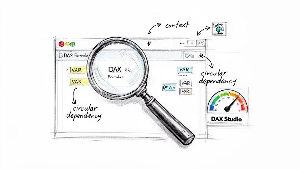
One effective habit for DAX development is using variables. When you declare a variable with the VAR keyword, the Power BI engine computes the result once and stores that value in memory. You can then reference this stored value multiple times throughout the rest of the measure.
Using variables stops the DAX engine from performing the same complex operations repeatedly. This leads to immediate performance improvements. Variables also make your code cleaner and much easier to read. Instead of managing a sprawling, nested formula, you create a step-by-step logic structure that simplifies troubleshooting. Because variables are constant once defined, they provide a stable point of reference within the formula.
Another quick win is choosing the right function for division. Using the standard / operator is often a point of failure in dynamic reports. If your denominator evaluates to zero, the visual will break and show an unhandled error message to the user.
The professional standard is to use the DIVIDE function. It was created to manage division-by-zero errors without breaking the report visual. The function typically returns a blank value or a specified alternate result instead of a terminal error. This practice ensures your reports remain stable even when the data contains gaps or unexpected zeros. It provides a consistent experience for the end user who may not understand why a calculation is failing.
Practical Debugging Strategies
When a measure returns a blank, an error, or an incorrect number, you must be able to find the source of the error quickly. The best way to debug is to isolate the problem. You should never try to fix a complex measure while it is still inside a crowded or complex visual.
Instead, create a new report page and add a simple table visual. Drag the problematic measure into this table and then add the columns that define its context, such as Product Category, Date, or Region. This methodical approach lets you see exactly what the measure is calculating for each row. Often, seeing the measure alongside its context reveals the logic error immediately.
For more difficult issues, DAX Studio is a necessary tool. This free, external utility provides a view into the execution of DAX queries and the data model. You can use it to analyze query plans, find performance bottlenecks, and identify logic that is not performing well. Professionals preparing for data engineering or analysis certifications often find that proficiency with tools like DAX Studio provides a significant advantage. We cover these advanced skills in our DP-700 Microsoft Fabric Data Engineer study guide.
Reflection Prompt: How does the strategy of isolating a problematic measure into a simple table visual compare to troubleshooting methodologies in other areas of IT, such as isolating network segments or logging in software development?
Avoiding Common Pitfalls
As data models grow, you will likely encounter several recurring issues. Recognizing these traps early can save hours of troubleshooting.
- Circular Dependencies: This error happens when Measure A depends on Measure B, while Measure B simultaneously depends on Measure A. Power BI detects this loop and stops the calculation. This issue usually points to a flaw in the basic design of the measures or the calculated columns.
- Incorrect Context Transition: The CALCULATE function is useful because it modifies the filter context. However, if you do not understand how it changes the context, it can produce unexpected results. This often happens when row context is turned into filter context during an iteration. The table visual trick is very effective for checking how the context is shifting.
- Ignoring Relationships: The accuracy of your measures depends on the relationships in your data model. If a measure returns the same total value for every row in a table when it should be filtered, it is usually a sign of a broken or inactive relationship between tables. Verifying these connections is a core part of the syllabus for the Microsoft Certified: Power BI Data Analyst Associate certification.
Improving these optimization and debugging skills goes beyond technical proficiency; it has a direct impact on user adoption and the overall value of your BI projects. Research shows that while 58% of organizations want to increase their use of business intelligence tools, 84% of these companies report adoption rates below 50% (verify current statistics on the vendor site).
A major reason for this lack of engagement is the difficulty of learning DAX and the frustration caused by slow, unreliable reports. The Power BI adoption statistics from Collectiv show that a 70% monthly usage rate is the standard target for achieving a return on investment (verify current statistics on the vendor site). Reaching that goal is nearly impossible if the data solutions are not optimized and trusted by the people using them.
What's Next on Your Path to Mastering Power BI Measures?
You have covered the basics, from the core definition of a Power BI measure to the creation of complex DAX formulas. This knowledge gives you a solid base for creating dynamic, clear reports. Now, the real work begins.
The most effective next step is direct application. Take the examples in this guide and use them on your own datasets immediately. Experiment freely. Do not worry about making mistakes; errors are often your best teachers. You will find that true skill in data analysis comes from regular practice, solving specific errors, and seeing how your formulas perform in actual business scenarios.
Taking Your Skills from Theory to Career
If you want to use Power BI to advance your career, follow a structured learning path. Learning where Power BI fits within data analytics—covering data governance, warehousing, and visualization—helps you become a well-rounded professional. You should focus on how measures interact with different data models, as this is where most complex business logic resides.
To master a Power BI measure, you must go past basic tutorials and work with actual data. Use what you learned here to test formulas against real business problems and improve your methods. This commitment helps you become the expert who provides the clear intelligence teams need for their daily operations.
For those seeking to prove their skills through certifications, preparation is vital. Reviewing resources such as our Azure DP-900 study guide offers a structured way to prepare for exams and confirm your understanding of data fundamentals.
Here is your plan for continued growth:
- Experiment: Use the DAX patterns and measures from this guide as starting points. Try to adapt them to your specific projects and unique data sets.
- Practice: Look for difficult business questions and write new measures from scratch to answer them. This builds your ability to solve problems on the fly.
- Keep Learning: The data field changes constantly. Stay curious, keep building new reports, and always ask how specific functions work within different contexts.
Following these steps helps you do more than just prepare for an exam. You will become a capable professional who turns messy, raw data into the clear, useful information that organizations use to make major decisions.
Your Top Power BI Measure Questions, Answered
As you grow your skills in Power BI, you will likely encounter confusing situations where your calculations don't behave as expected. These hurdles are a standard part of the path for data professionals. Instead of getting stuck, use these common questions and answers to clarify how measures function within your reports.
Can One Measure Use Another Measure in Its Calculation?
Yes. Referencing an existing measure inside a new calculation is more than just allowed; it is a vital practice for creating efficient data models. Professional developers call this method measure branching. It allows you to build a library of simple, atomic calculations that serve as the building blocks for more complex logic.
For example, you might start by defining a basic sales measure:
Total Sales = SUM(Sales[Revenue])
Next, you can create a measure for the previous year's sales by referencing that base calculation:
Prior Year Sales = CALCULATE([Total Sales], SAMEPERIODLASTYEAR('Date'[Date]))
Finally, when you need to calculate Year-over-Year Growth, you do not need to rewrite the SUM or CALCULATE logic. You simply use the names of the measures you have already built:
YoY Growth % = DIVIDE( [Total Sales] - [Prior Year Sales], [Prior Year Sales] )
This modular structure makes your work easier to manage over time. If your organization changes its definition of revenue—for instance, by excluding specific types of returns—you only need to update the Total Sales measure. Every other calculation that references it will update instantly. This ensures your report remains consistent and reduces the time you spend auditing formulas for errors across dozens of visuals. Using this technique transforms a messy collection of formulas into a structured, organized system.
Why Is My Visual Showing Blanks Instead of Numbers?
Seeing a blank in a chart or table can be confusing, but it is actually a specific response from the DAX engine. In Power BI, a blank is not the same as a zero. A zero indicates that a calculation was performed and resulted in nothing, whereas a blank indicates that no data was available to evaluate in the first place.
When a measure returns a blank, it means the current filter context has excluded all relevant records. This happens when the filters from your slicers, your report pages, and the specific data points in your visual combine to create a set of data that is empty. For instance, if you filter for a specific product and a specific store, but that store never stocked that product, the measure will return a blank.
Key Insight: A blank is a diagnostic tool. It tells you that the intersection of your filters has left the measure with nothing to calculate.
To fix this, try to isolate the cause. Start by moving your measure into a simple table visual on a new page. Add the columns you are using as filters one at a time. Watch the numbers carefully as you add each column. You will eventually find the specific combination of category, date, or region that is causing the data to disappear. This process helps you understand how filters flow through your model and identifies if your data relationships are missing necessary links.
How Can I Make My Chart Show Categories That Have No Data?
You might encounter a situation where you want to see all products in a bar chart, even those with no sales. You check the "Show items with no data" option, yet products still disappear when you use a slicer. This happens because of how Power BI handles filters between tables.
If your chart's axis uses a column from your sales table, the visual can only display what exists in that table after filters are applied. If you filter for the year 2023, and five products had no sales that year, those products are removed from the filtered sales table. Since they are gone from the data, the axis has nothing to display.
The correct way to handle this is by using a dimension table. This is a central table that contains a unique list of every item in a category, such as all products, all employees, or all store locations. Instead of pulling your axis labels from the sales table, you pull them from this dimension table.
Because the dimension table is linked to the sales table through a relationship, it can provide the full list of names for the chart axis regardless of what is happening in the sales data. When a filter is applied, the dimension table still holds the names of the products with zero sales. The measure will calculate a blank for those items, but the names will remain on the axis. This keeps your charts stable and provides a clearer view of performance gaps across your entire business. Adhering to these star schema design principles makes your reports more reliable and provides the structure needed for advanced business intelligence.
Ready to turn your knowledge into a verifiable skill? MindMesh Academy provides expert-led study guides, detailed practice materials, and structured courses built to help you master technical concepts and pass your certification exams with confidence. Strengthen your professional standing by exploring our full range of resources and certifications at MindMesh Academy.

Written by
Alvin Varughese
Founder, MindMesh Academy
Alvin Varughese is the founder of MindMesh Academy and holds 18 professional certifications including AWS Solutions Architect Professional, Azure DevOps Engineer Expert, and ITIL 4. He's held senior engineering and architecture roles at Humana (Fortune 50) and GE Appliances. He built MindMesh Academy to share the study methods and first-principles approach that helped him pass each exam.